If you’ve ever watched someone truly skilled working with timber, there’s a certain rhythm to it. The preparation, the shaping, the slow build toward a finished floor that looks effortless but has been carefully perfected piece by piece.
Oakcraft Floors was already operating at that level, yet the brand felt more like a standard trade business than someone who treats flooring as an art form. The challenge was to shift perception so that the brand reflected the same level of care and obsession with detail that clients experience when they work with him.

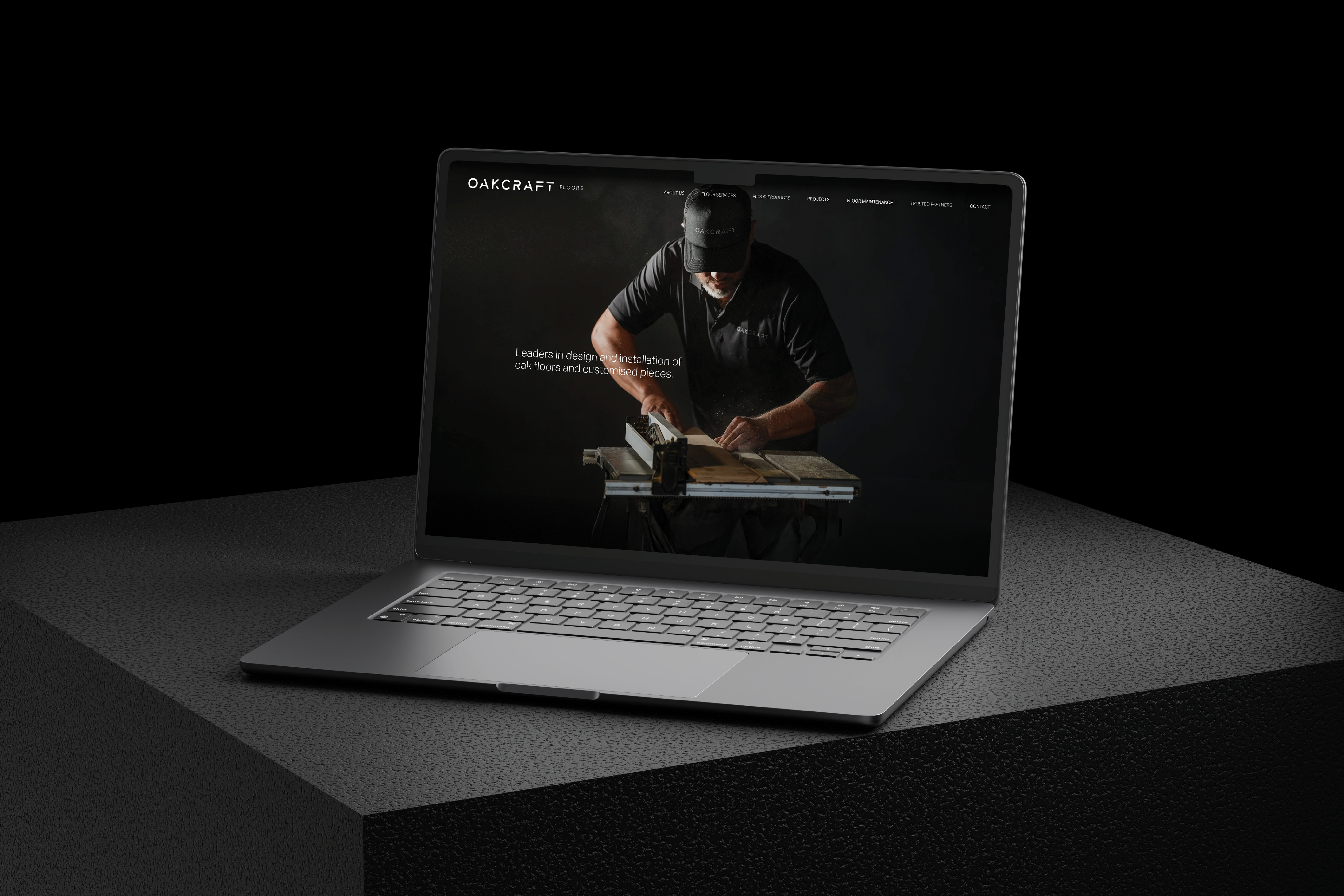
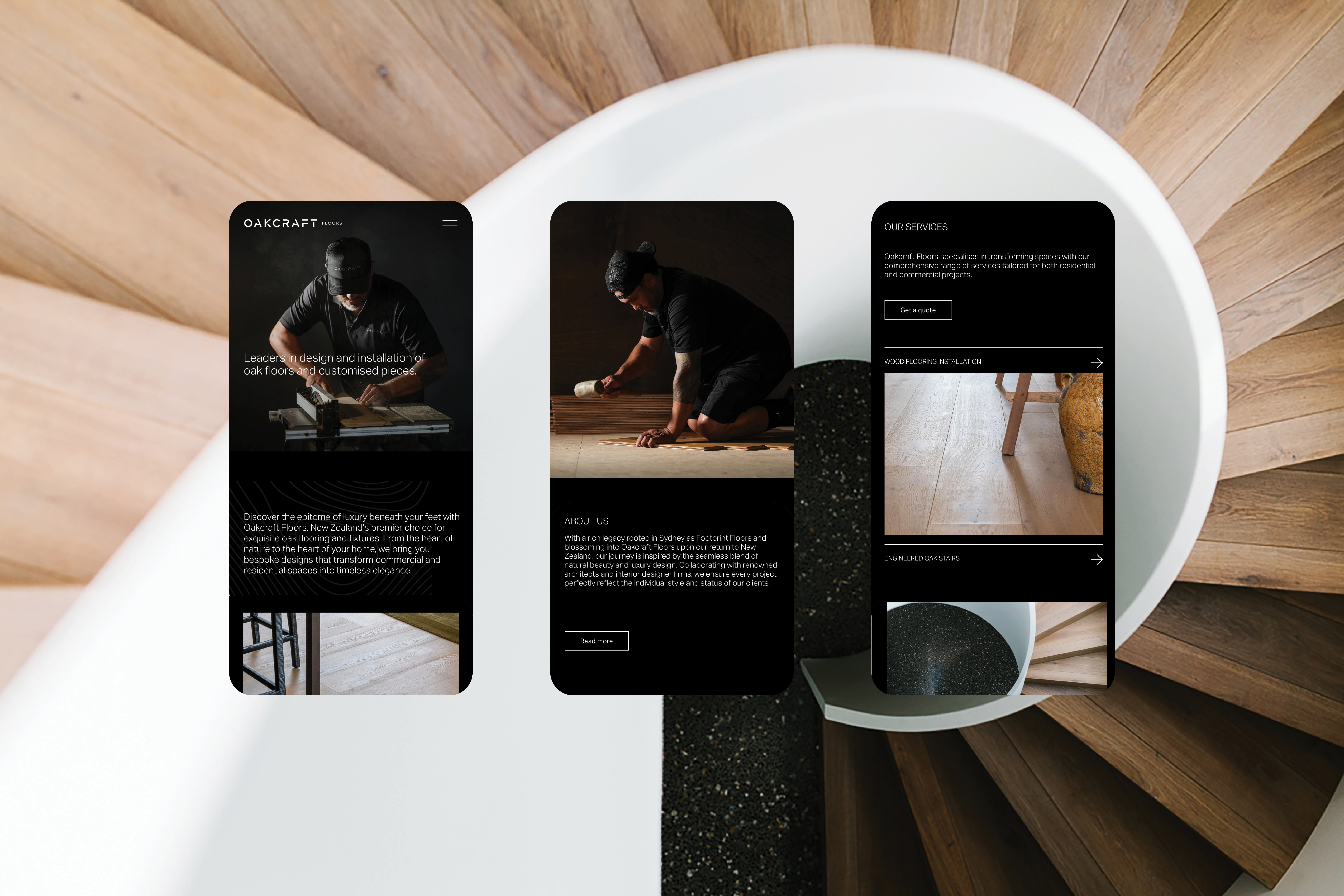
We created a modern wordmark that immediately brought a stronger sense of presence to the Oakcraft name and helped reposition the business alongside the calibre of projects he was already delivering.
The effect of that change became obvious very quickly. When the new logo was signwritten onto his (slightly beaten up) old van, people began asking whether he had upgraded it, simply because the business suddenly looked more premium drawing the eye away from previously noticeable imperfections!
Alongside the identity we developed photography, the website, stationery, and brochures that lean into the mood of the craft itself. Tools at work, fine dust catching the light, and the quiet concentration that comes with doing something properly.
What changed was not the work, which had always been excellent, but the way people understood it. The brand now reflects the level Oakcraft has been operating at all along, making it far easier for clients to recognise the care and skill behind every floor.