Fenway had all the ingredients of a strong residential project, but the current marketing felt too generic and commercial.
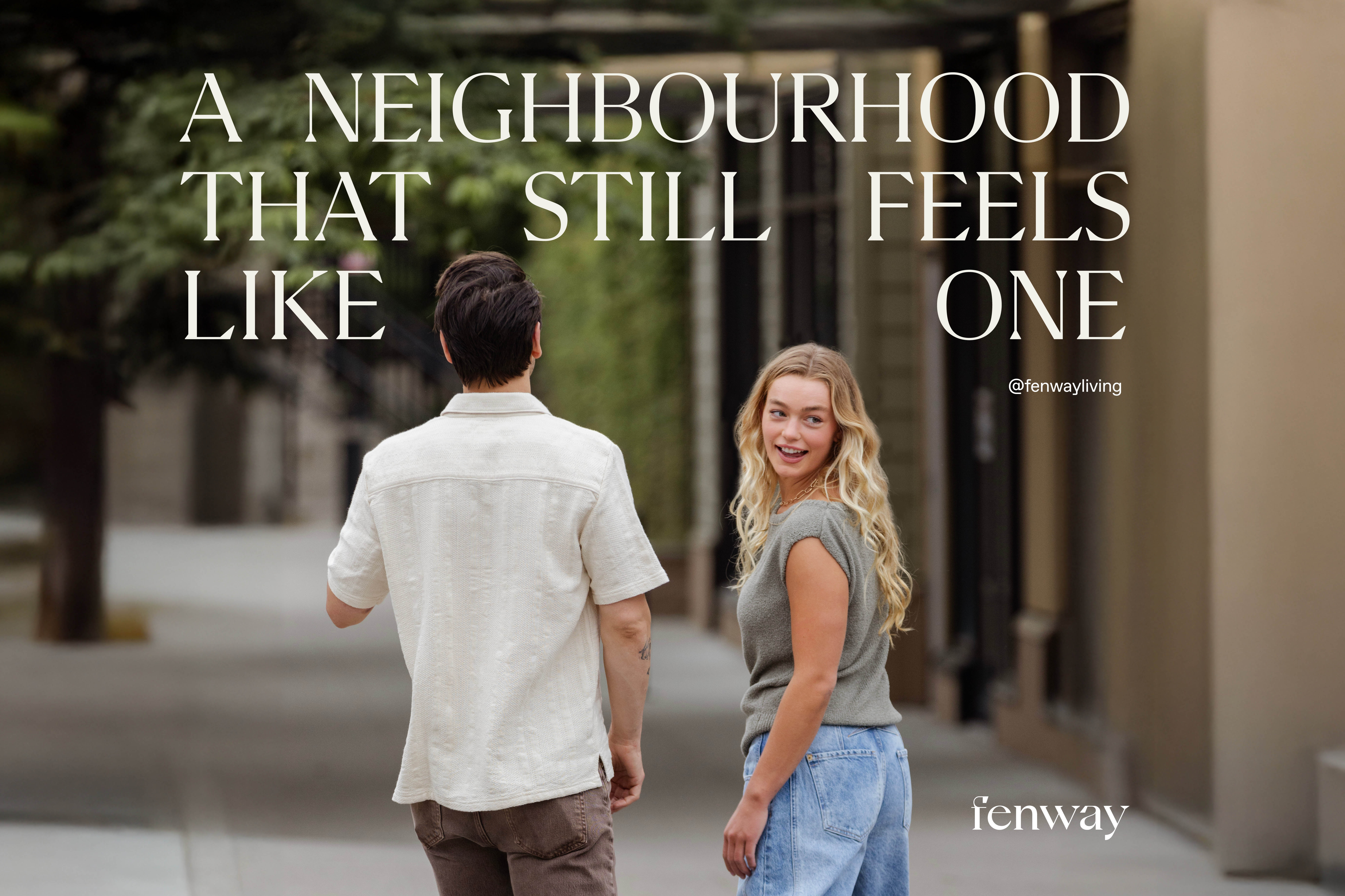
The opportunity was to introduce a different tone. Something closer to editorial than advertising, where the imagery and brand language helped people imagine the rhythm of life there rather than simply showing the buildings.
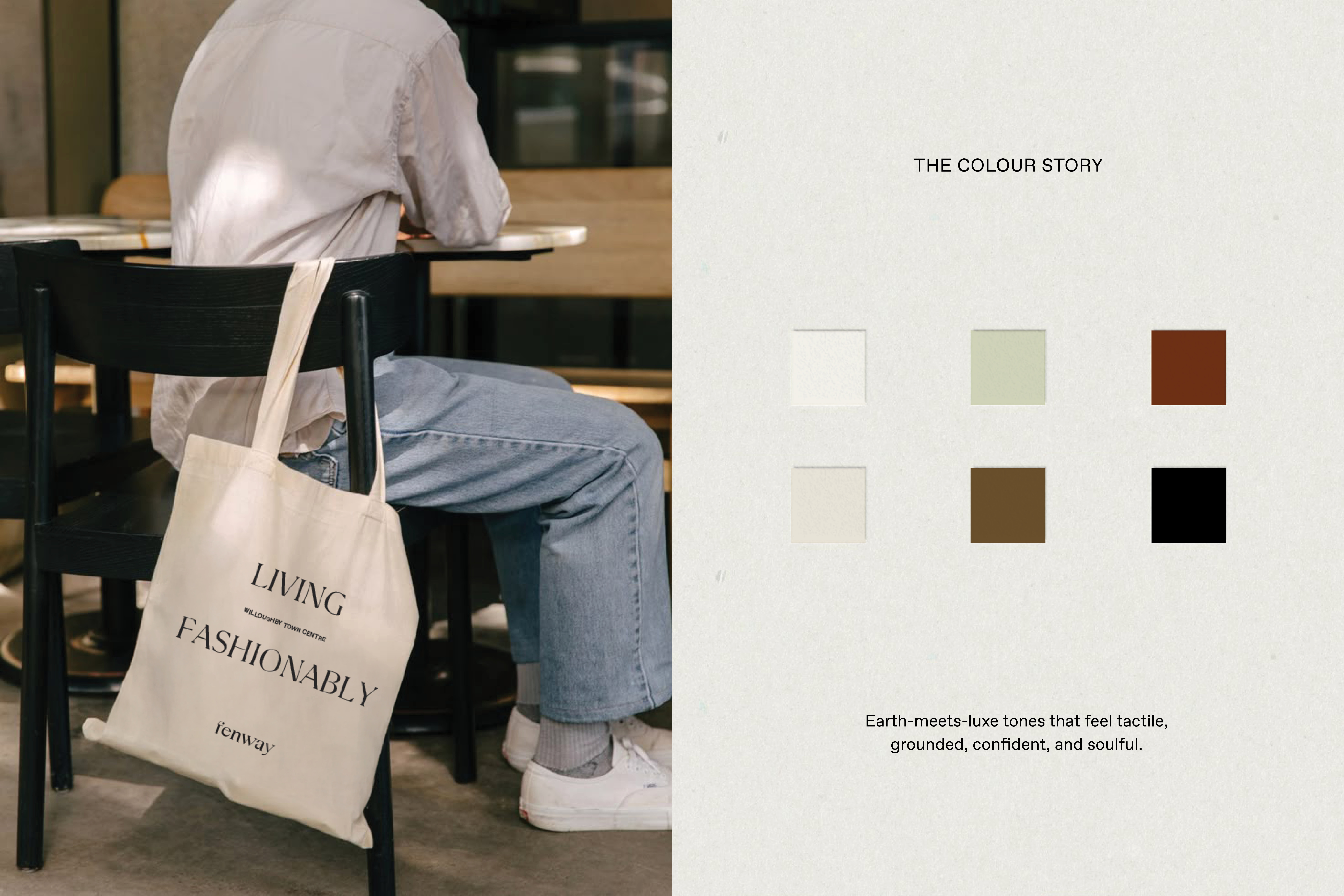
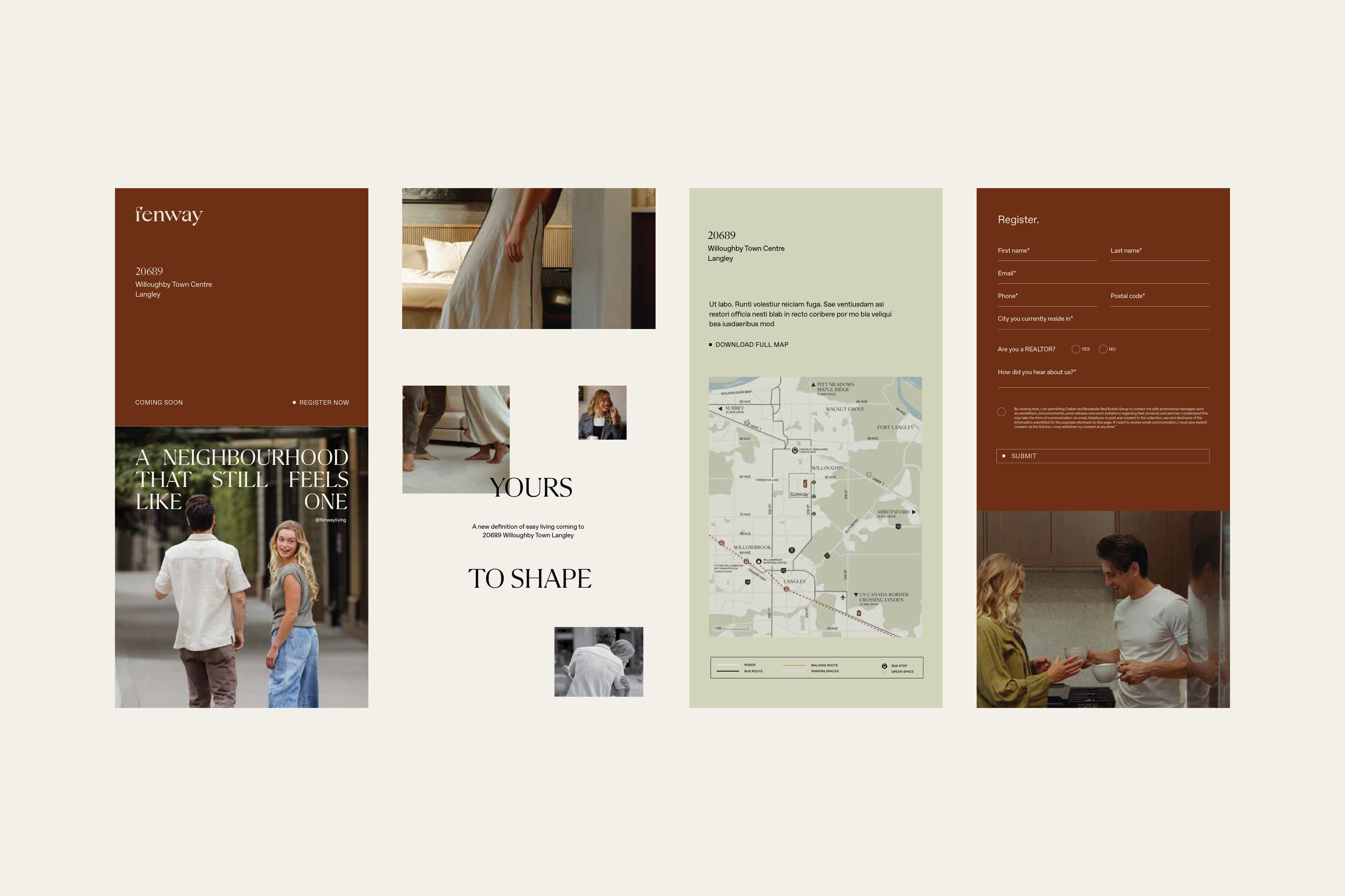
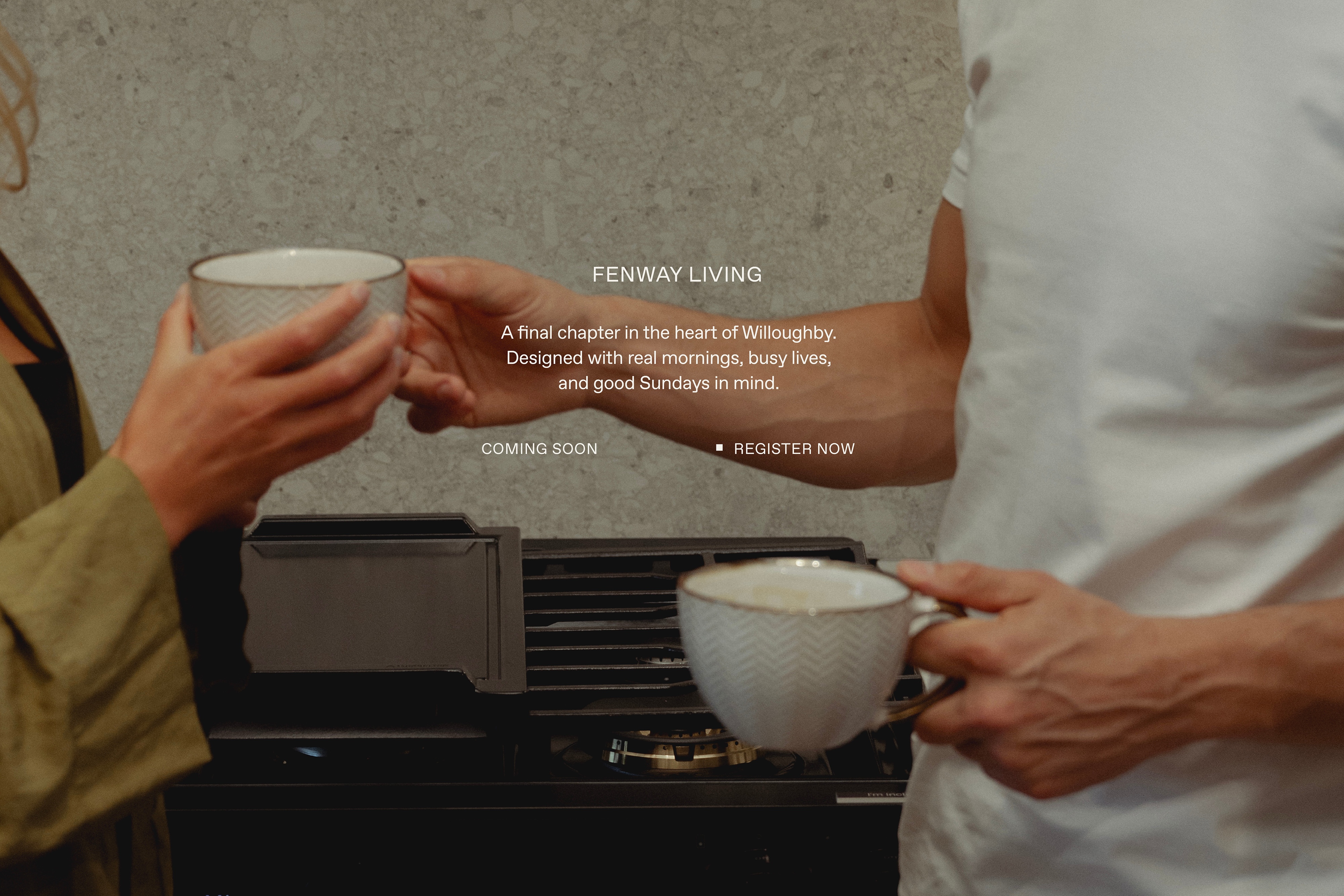
Photography became the key to that shift. Instead of focusing only on architecture, the visuals captured everyday moments inside the homes and around the neighbourhood. Coffee on the bench. A walk down the street. The small details that turn a development into somewhere people can picture themselves living.

Working alongside Sketch Studio, Good Thunder refined the existing brand identity and built a visual system that carried across the project.
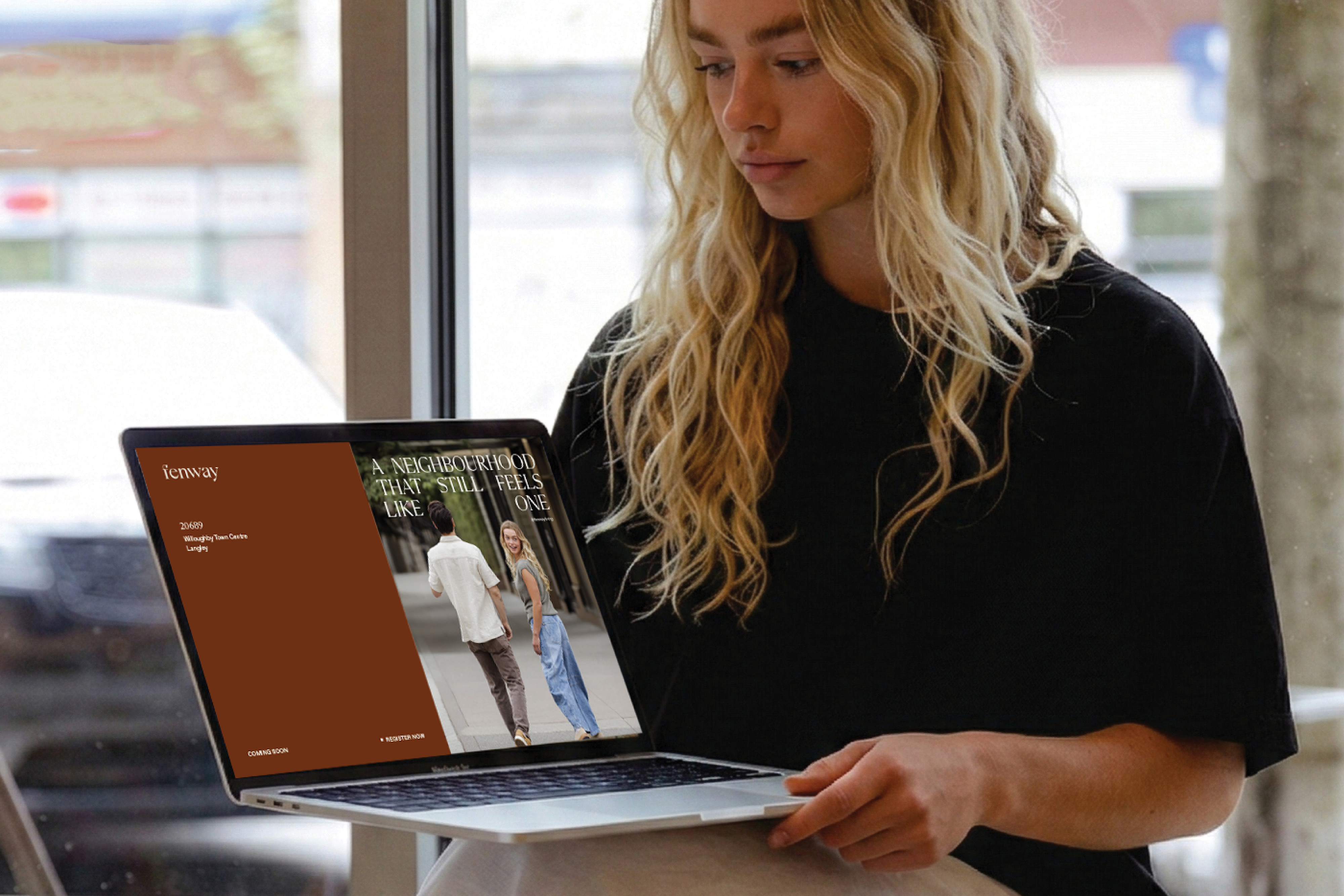
The logo was carefully refined, the typography and colour palette were tightened, and a lifestyle-driven photography direction was introduced to anchor the brand. From there, the work extended across the website, brochure, signage, stationery, social media, and email marketing so every piece of communication felt connected.
Fenway now presents itself in the way the development was intended to be experienced. A neighbourhood people can imagine stepping into, not just a set of buildings on a plan.