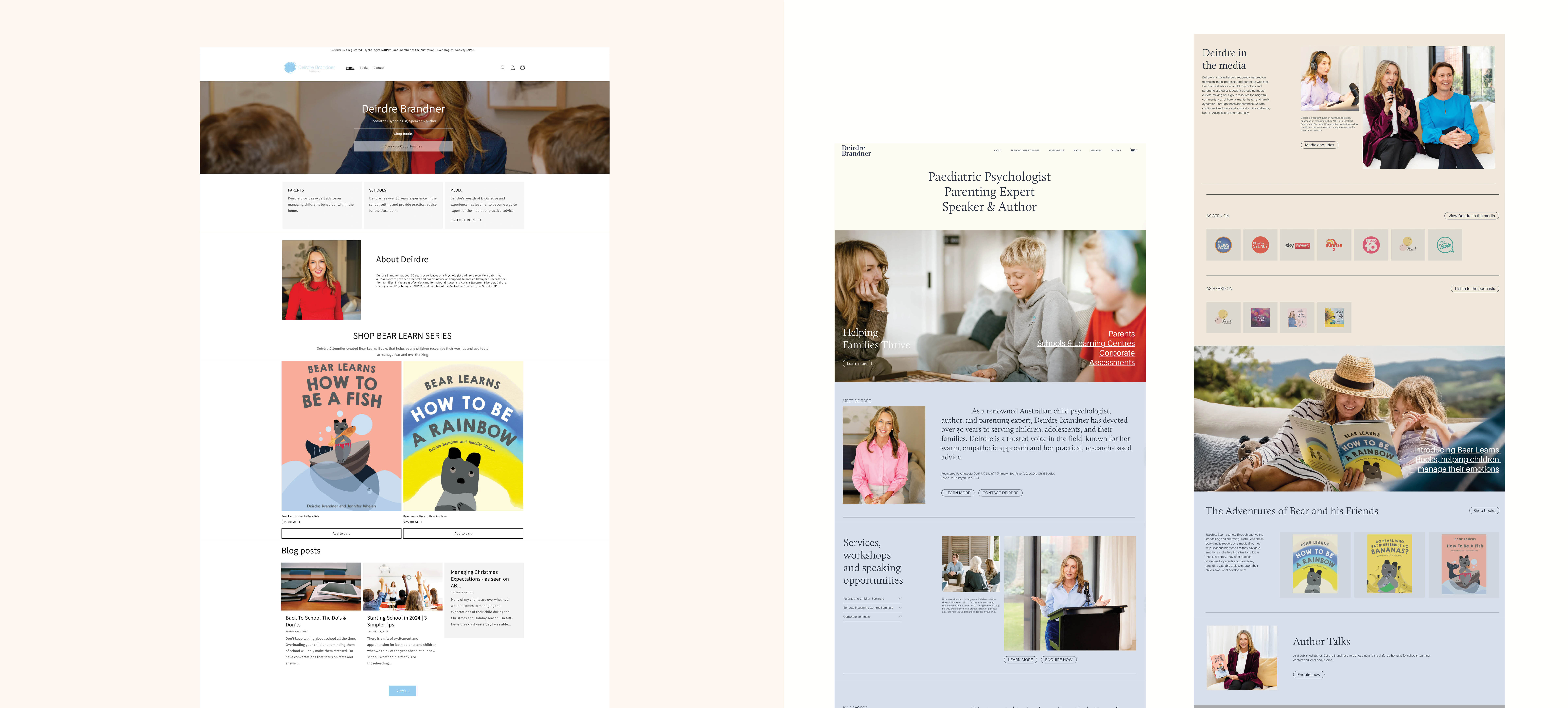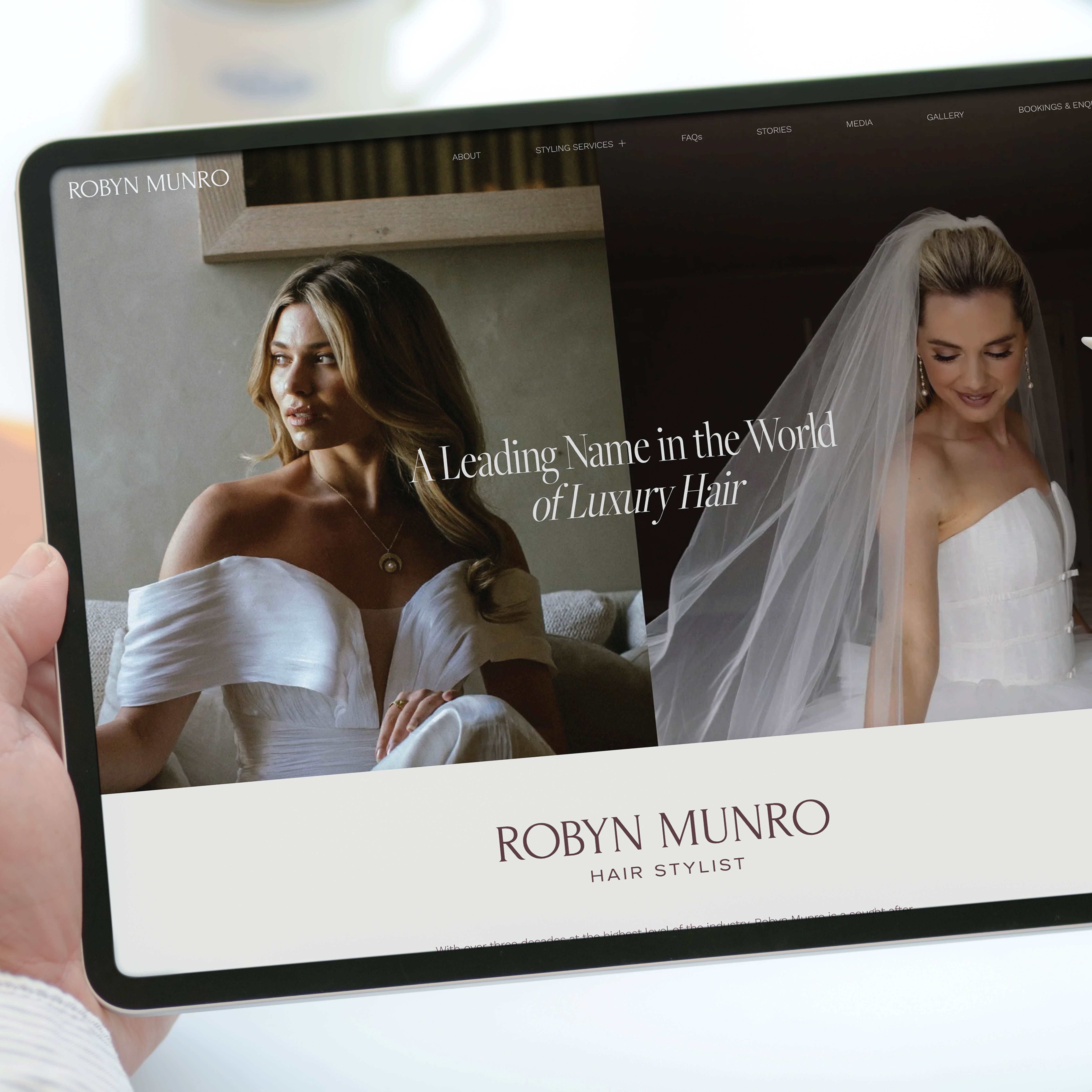
There is something satisfying about seeing a before-and-after side-by-side, particularly when nothing about the business itself has changed.
In most cases, the issue is rarely capability. The business and offering are sound, and the person behind it knows what they are doing. What sometimes falls short is how that is communicated.
A brand, website or marketing material might feel slightly dated or harder to navigate than it needs to be. The design can feel a bit generic, templated, or just not quite right for the target market. When these small details are addressed, the shift is immediate. The same business becomes easier to trust. You can instantly understand what is being offered and who it is for. The overall impression becomes more aligned with the quality of what is actually being offered.
That is what makes side-by-side comparisons so useful. You can see the difference without needing it to be explained.
Scroll on to see the glow-ups.