Robyn Munro already knew. That's the thing about working with someone who has spent their career in fashion and editorial. She didn't need us to tell her that her website wasn't right, she could see it herself, and she knew exactly what it needed to feel like. What she needed was someone to actually build it to her vision.
She came to us with a comprehensive brief, and some cool conversations along the way. We took a deep dive into her industry and why her clients insist on working with her. Her existing Squarespace site was contemporary enough, functional, nothing obviously wrong with it. But it was bland in a way that had nothing to do with who she is or who she works with. The fonts were stock standard. The warmth wasn't there. And the names, the brides, the clients, the editorial credits, none of it was being used in a way that told the real story of what she does and at what level she does it.
Robyn has been styling hair for over three decades. Her clients include some of New Zealand's most recognised names. She has been featured in Together Journal, Hello May, New Zealand Wedding Magazine and Fashion Quarterly. She travels to Europe regularly for work. This is not someone who should have a website that looks like anyone else's.
The brief wasn't about getting more enquiries – it was about getting the right ones. Robyn works with discerning clients, people who care about who is touching their hair on the most important days of their lives, and she wanted her website to do the filtering before anyone picked up the phone. A bride who lands on her site and immediately feels like this might be out of her league is not the right client. A bride who lands on it and thinks yes, this is exactly what I've been looking for, that's who Robyn is after.
We kept the logo. Everything else changed.
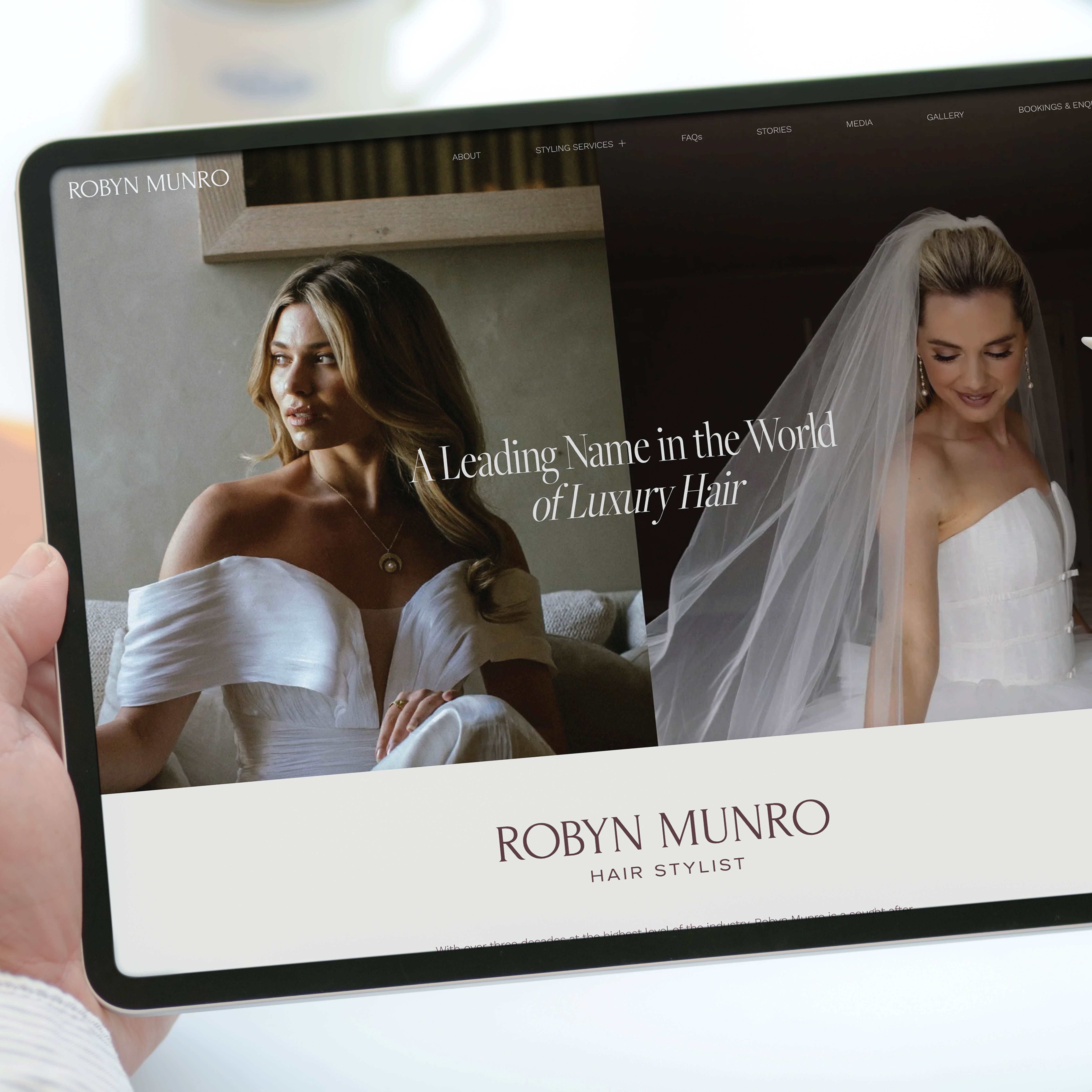
The fonts were the first thing. We coded in typefaces that gave the site the editorial depth it needed, something that felt fashion-adjacent without being try-hard about it. The colour palette shifted to match. Warm, refined, the kind of palette that says luxury. The overall feel moved from contemporary but boring to something that felt like it actually belonged to her.

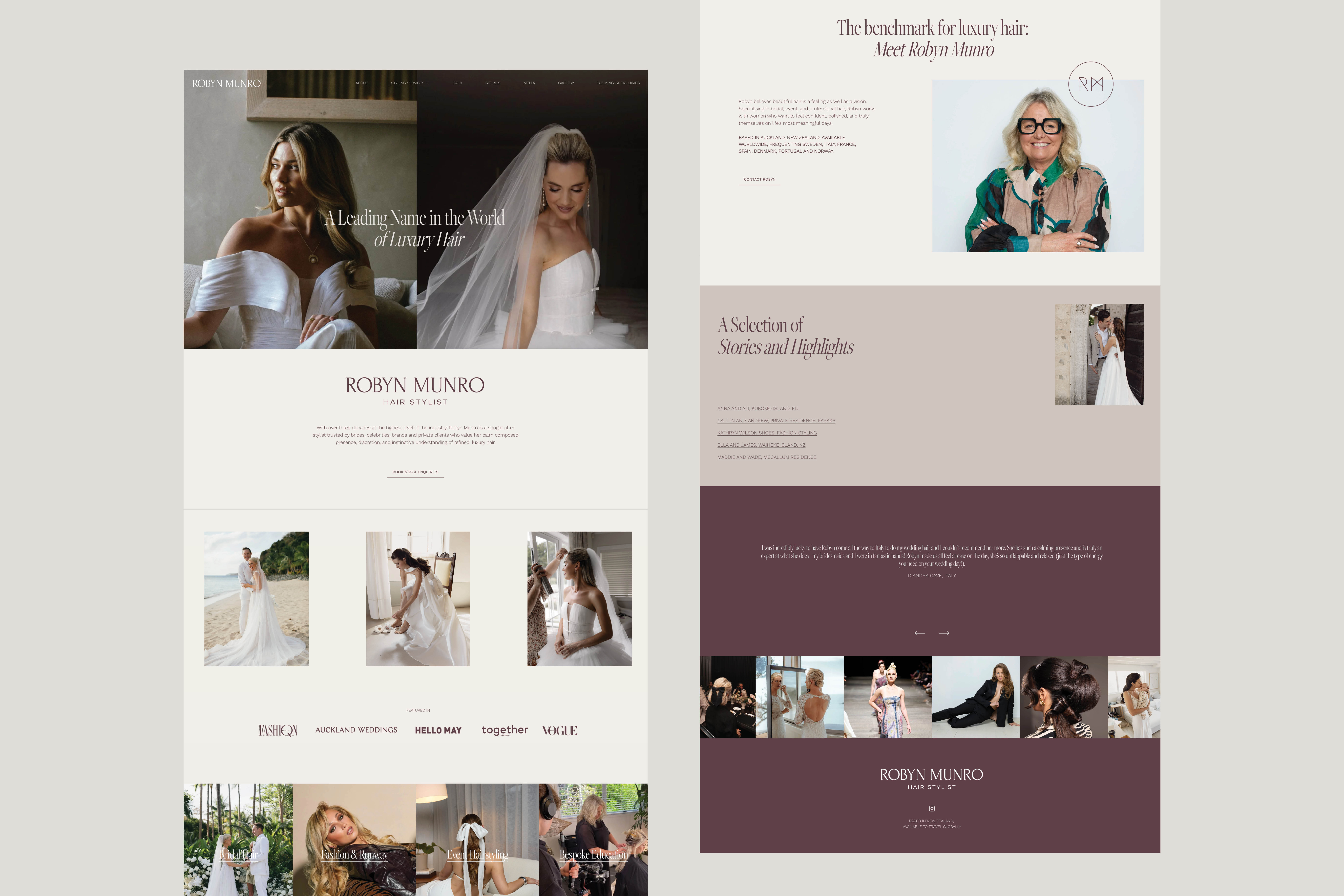
Then we looked at the content. The names were there, sitting in the gallery, not doing anywhere near enough work. Anna Williams. Caitlin Crisp. Kokomo Island. Italy. Waiheke. These are not details you bury. They go on the homepage, they go in the image filenames, they go in the places Google and AI searches look first, and so do the people Robyn wants to find her. Luxury bridal hair stylist Auckland. Celebrity hairstylist New Zealand. Top rated hair stylist in Auckland. Every page, every image, every heading was written for the person searching for exactly what Robyn offers.
The testimonials got the same treatment. When a client writes that she booked Robyn before she even locked in her wedding date, that goes front and centre. When another says she is the epitome of class, that earns its place on the homepage.
When we showed Robyn the finished site her response was immediate. I LOVE IT !!!!!!! So great love your input and you are bang on yay !!!!
The thing this project illustrates, and the reason it's worth writing about, is that a website is not just a place to list your services. It's the first impression a potential client gets of you, and for someone like Robyn, whose entire reputation is built on taste and discernment, that impression needs to match the experience of actually working with her. It wasn't matching. Now it does.
If you're at a point in your business where the work you're doing is better than the way you're presenting yourself, that gap is worth closing. It doesn't always require a full rebrand. Sometimes it's fonts and hierarchy and knowing which words to put where. But it requires someone who understands what you're actually trying to say and who you're trying to say it to.